
Client
Purple Door Records
Scope
Branding Vehicle Wrap Corporate Collateral Apparel Marketing Assets

Client
Purple Door Records is a music production company with a focus on indie artists and singer/songwriters. The name is inspired by the home studio in which they were founded. Designed to cater to a youthful, creative crowd, the brand’s mission is to support up-and-coming talent in a relaxed and approachable way. Purple Door Records offers a fresh take on the music scene, providing a platform for unique voices to shine, while embodying a retro, funky aesthetic that resonates with the indie community.
Scope
The client sought a brand identity that would connect with their target audience, hip, young music lovers, while reflecting the company’s throwback and cool vibe. The goal was to create collateral that feels authentic and engaging, from the logo to the promotional materials. The design needed to capture the brand’s essence of creativity, individuality, and soul, resonating across a wide range of touchpoints.
Impact
The resulting brand assets include a retro logo, stylish corporate collateral, a custom van wrap, event flyers, stage graphics, and t-shirts. Each element was designed to reinforce the retro-inspired aesthetic while appealing to an audience that values authenticity and artistic expression. The logo serves as a central visual anchor, complemented by a bold color and typography. The promotional materials bring the brand to life in a way that feels both personal and professional.
How it looks


More work

The UltraWellness Center

Hyman Health

Audacity Health

Carr Biosystems

MedGenome

Personalis

Personal Genome Diagnostics

Overland Worldwide
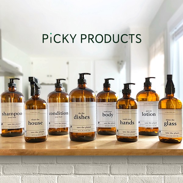
Picky Products

EcoCiv

Viva Comida

Grand Slamma

AOK Energy

Purple Door Records

Griffin Athletic
More work
The UltraWellness Center
Hyman Health
Audacity Health
Carr Biosystems
MedGenome
Personalis
Personal Genome Diagnostics
Overland Worldwide
Picky Products
EcoCiv
Viva Comida
Grand Slamma
AOK Energy
Purple Door Records
Griffin Athletic
More work
The UltraWellness Center
Hyman Health
Audacity Health
Carr Biosystems
MedGenome
Personalis
Personal Genome Diagnostics
Overland Worldwide
Picky Products
EcoCiv
Viva Comida
Grand Slamma
AOK Energy
Purple Door Records
Griffin Athletic

Where to spot me
Where to spot me
Where to spot me