

Client
AOK Energy
Scope
Logo Color Palette Creative Assets Packaging Design Marketing Assets

Client
AOK Energy is a newly launched energy drink brand designed for a generation seeking clean, guilt-free energy. With a focus on wellness, the brand offers a unique beverage that is free of sugar, caffeine, and calories, providing a refreshing alternative to traditional energy drinks. AOK’s core values center around clarity, simplicity, and positive energy, offering a product that fuels both body and mind without the usual crash. Their commitment to delivering feel-good energy makes AOK the go-to choice for conscious consumers, because when you choose AOK, it's all OK.
Scope
The goal for AOK Energy was to create an identity that communicates the brand's clean offering while appealing to a modern, health-forward audience. I wanted to develop an eye-catching design system that reflected the brand's values, offering energy without the bad stuff. The focus was to balance boldness with simplicity, ensuring the identity remained sharp and approachable while standing out in a crowded market.
Impact
The Brand Identity for AOK Energy delivers a strong, minimal aesthetic that is adaptable across digital, print, and packaging applications. Key deliverables included logo design, a distinctive color palette, a custom graphic set, and product packaging. These elements work together to build a cohesive brand story that’s confident and clear. The final design establishes a visual language that captures AOK’s essence; clean, playful, and energetic.
How it looks


More work

The UltraWellness Center

Hyman Health

Audacity Health

Carr Biosystems

MedGenome

Personalis

Personal Genome Diagnostics

Overland Worldwide
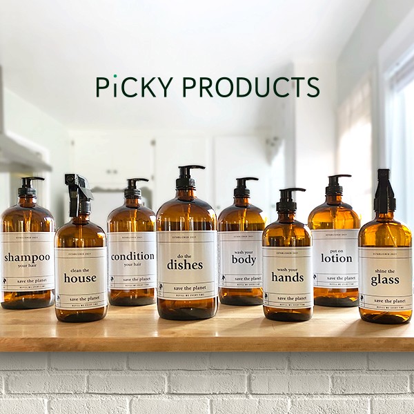
Picky Products

EcoCiv

Viva Comida

Grand Slamma

AOK Energy

Purple Door Records

Griffin Athletic
More work
The UltraWellness Center
Hyman Health
Audacity Health
Carr Biosystems
MedGenome
Personalis
Personal Genome Diagnostics
Overland Worldwide
Picky Products
EcoCiv
Viva Comida
Grand Slamma
AOK Energy
Purple Door Records
Griffin Athletic
More work
The UltraWellness Center
Hyman Health
Audacity Health
Carr Biosystems
MedGenome
Personalis
Personal Genome Diagnostics
Overland Worldwide
Picky Products
EcoCiv
Viva Comida
Grand Slamma
AOK Energy
Purple Door Records
Griffin Athletic

Where to spot me
Where to spot me
Where to spot me